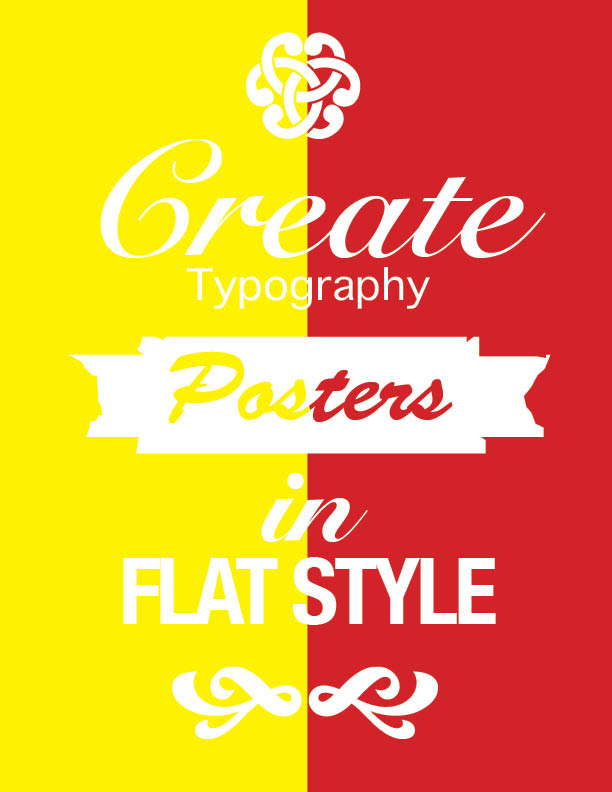
For this assignment, we were to create a publication page using the images and text given to us. We understood how to shape a paragraph around a photo, how to increase the amount of columns we use, and used our previous knowledge of the gradient tools and other effects to create this page. I created this page based off the other design given but combined my own ideas of putting a picture in the middle of the paragraph and used another image of a turtle to change the shape of the paragraph.
The images of the bottom, middle and bottom in between the letters were given to us and we were to use them and change the size of them by understanding how to use the selection tool and direct selection tool. You can use the selection tool and press shift and option to increase the size of the image entirely. We then had to select the font that was closely related to the given format and changed the sizing and use the tools at the top to change the sizing and spacing of the letters. the letters were not exact, but we were very close to the size that was provided.
For this assignment, we had to create an infographic poster on anything that we would like and use illustrator to create the shapes that were on the page other than the image of the people inserted on here. I chose to create an infographic poster on the debate of which soccer player is better, Messi or Ronaldo. I created a soccer ball and trophy in illustrator and then grouped the image together so that the image doesn’t move in the main poster. I then created the different logos that the player was sponsored using the pen tool.
For this assignment, I used the pen tool in order to trace any types of logos so I chose Adventure Club (DJ), Illenium (DJ), Sector 9, and Stone Brewery. I blew up the entire image in order for me to get precise with the tracing in which I created the shapes on the outside first and went inward so that it would just add a layer onto rather than having to rearranging the traces.
For this assignment we were to make a personal logo and I choose to make a logo for my music DJ name which is Doc XANDR. I created this by using the Rx for a doctors and adding a D in front. I completed XNDR by using a different font and I then traced out the lettering. I then broke up the prescription bottle by creating the orange bottle first, then the cap and then the white labeling by using the pen tool and tracing the entire bottle out. I then traced out the lettering that is on the bottle and put everything onto one file.
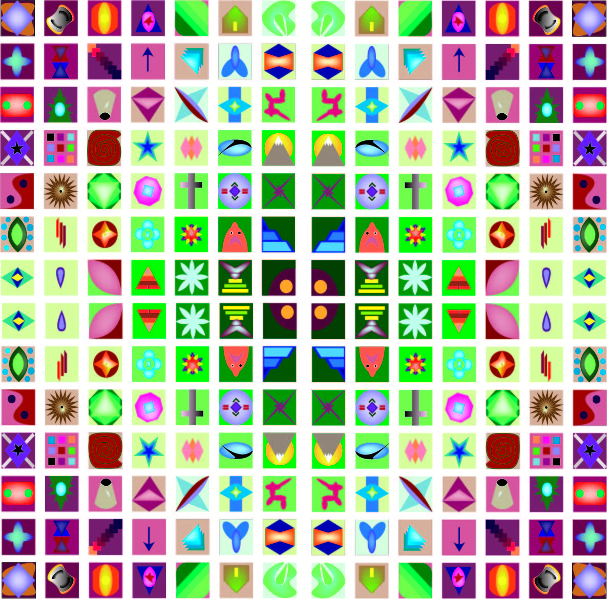
I created a 7×7 grid with one-inch square boxes that has a 12-point space in between each of the boxes. Within each of the boxes, I made different designs in which I used the outline to create the shapes and images. Once I was done with creating shapes within boxes, I took away the outline and used the fill for each of the shape in which I used effects like shadowing. I copied and pasted all 49 boxes three times where I then reflected the different 49 boxes to create the finished project.
I created this pear by using the pen tool. The pen tool could be used to draw straight lines or if you presss and hold, you can create a curved line which i used to create the round shape. I made sure that the outline and fill is clear so i can make sure that i am tracing the outline as close to possible.
The elephant was already created with different shapes and the usage of the pen, however the assignment was for us to understand how to create different swatches and different effects to add color to it. To create different colors you want to use the windows pull down menu press workspace and make sure we use essentials classic in order for us to get the right selection menus on the side to create the swatches. We would change the different settings within the menu in order to create a new swatch and new color.
For this assignment, I practiced using the pen tool in Adobe Illustrator in which we would make shapes and alter them in order to create a pencil. The main shapes I would use would be a rectangle and then alter the rectangle to have rounded corners or I would insert an extra point in the middle of where the pencil lead would be and delete the corners in order to create the triangle shape
In this project, I created a Mental Health Awareness poster because I have dealt with mental health my entire life. I wanted to create this poster in a way that it shows a person is stuck within their own mind. Within their own mind is their brain in which is always thinking and processing things that this person worries about either depression, anxiety, bipolar disorder, ect., and this person cannot control whats going on in their mind. to do this I used a silhouette of person that their own brain is somewhere else while this person is stuck thinking in a dark place. I used a masking layer to allow the picture to be within the silhouette of a head. Their brain is thinking about a million things and cannot control what happen their happiness because they do not know how to. So I wanted to split this person’s brain into things that most people worry about because they are constantly thinking about these things. So when I split up this brain I used a mask and created an outline in which this picture would only be seen within the selected part which is done for each part of the brain. I wanted the background of this photo to be a somewhat happy background because most people think that this person is happy on the outside, but on the inside they are struggling and need help.